Prototyping and Designing for Multiple Device Sizes
With smartphones now being a part of our everyday lives, it's no secret that mobile applications have become significantly commonplace across a broad range of industries. From social media and music streaming apps to shopping and online banking, smartphones enable us to complete nearly any day-to-day task right from one little device. Because of this, prototyping for mobile devices is ever more important.
However, mobile prototyping and designing does come with challenges and limitations, such as the need to design for a wide variety of device sizes. In Axure RP, prototyping for various mobile devices is made possible with adaptive views, which allow you to create alternate versions of pages designed for specific screen sizes. By embracing this feature, you can expedite your workflow by avoiding the need to recreate a prototype from scratch for each and every screen size you're designing for. Since each device size view that you add inherits the widgets and designs from the base view, all you have to do is rearrange and resize to fit the page dimensions.
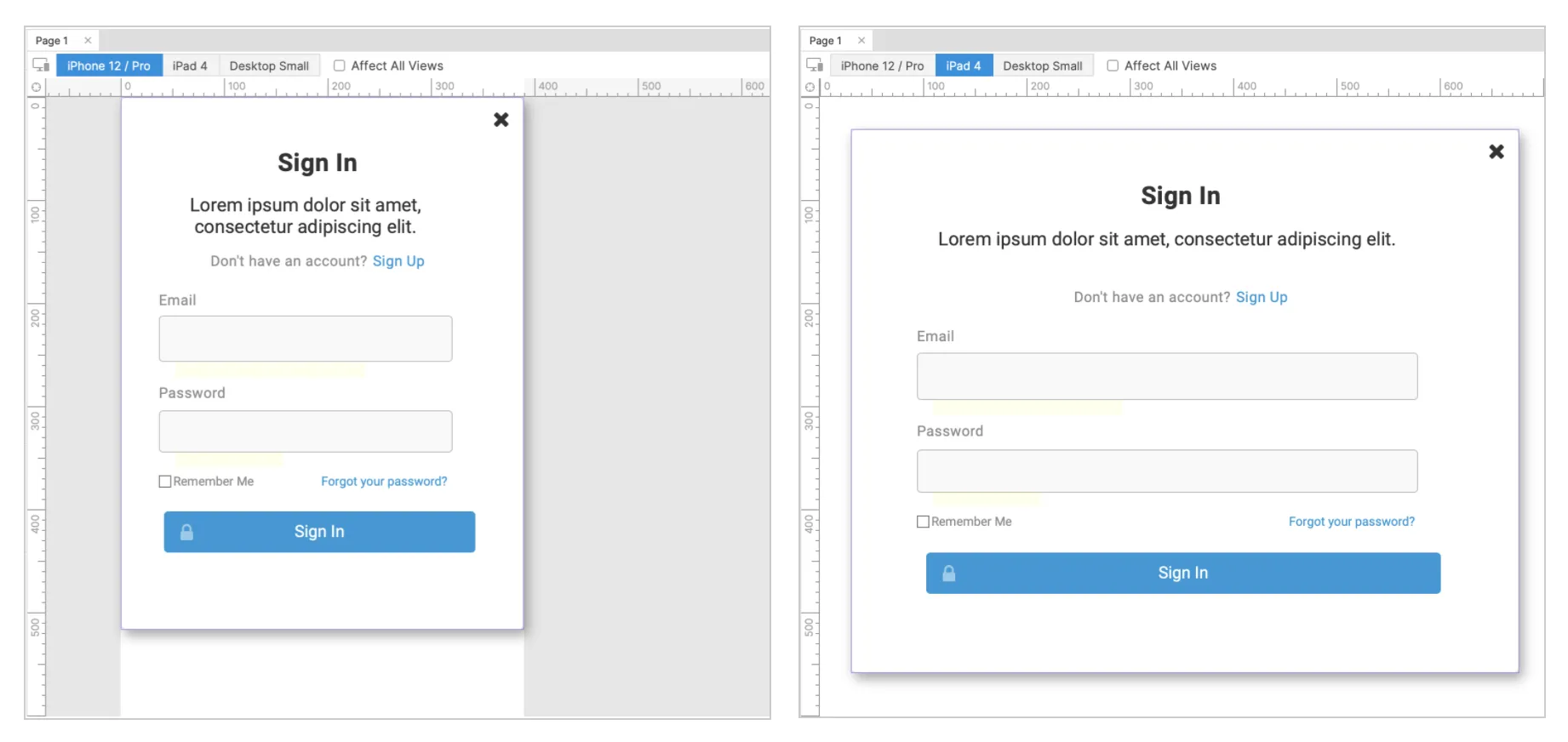
In the example below, you can see how the same design is easily adjusted to fit different screen sizes, and you can switch between your different adaptive views from the toolbar at the top of the canvas.
We hope this helps spark new ideas for building prototypes for various device sizes! For more tips, check out our mobile pattern tutorials, such as the Swiping Slideshow and Toggle Switch tutorials.
Happy prototyping!
To download your free trial of Axure RP 10, head over to axure.com/download.