Finding the Balance When Prototyping Data-Intensive Features
Note from the editor: We are excited to share another article in our User Stories, a blog series highlighting industry stories from real Axure users. The UX industry is diverse and quickly evolving with software, web, and mobile applications dominating the modern landscape. Read these stories of UX projects in action to learn more about how the community overcomes industry and workplace challenges and what the future of UX may hold.
When prototyping a data-intensive feature like an interactive online calculator, there is a need to balance creating a prototype that simulates the real-world experience with not prototyping everything. According to the Genworth Beyond Dollars Study 2018, most people are not planning for long term care. One way we help people to take their first step in planning for long term care is through our award-winning interactive calculator.
I've developed several prototypes for Genworth's Cost of Care Calculator (Image #1) which provides users with the cost of long term care services in their area. The sheer number of interactions you can produce with a calculator like this along with the extensive capabilities of prototyping software like Axure at your disposal, make the potential for prototyping more elements and interactions than you need for testing real. Too much time creating your prototype provides little time to resolves issues revealed in testing.
After three years of working on this interactive calculator, I've learned to find a workable balance. Here are some tips for focusing your prototyping and testing approach with data-intensive features.
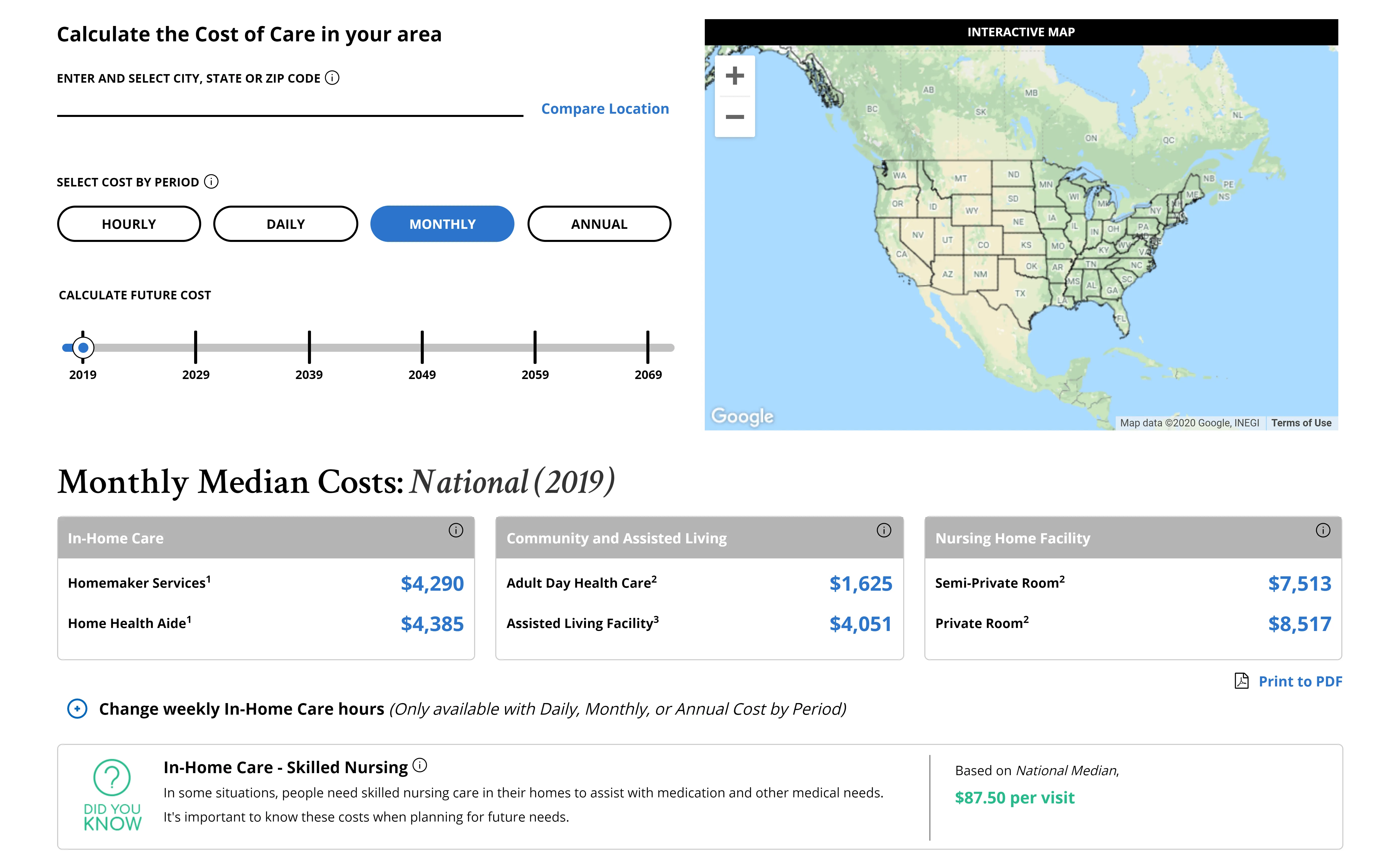 1- Genworth's Cost of Care Calculator
1. Test with lower levels of fidelity when possible.
Take advantage of paper prototyping, wireframes, and low fidelity mockups to test broader issues like information architecture, page layout, and page-to-page interactions early on. They don't have to require a lot of time. This allows you to get the content and layout decisions out of the way so you can focus your efforts on testing interactions with a high fidelity prototype.
2. Take time to plan exactly how you are going to approach the prototype.
Software capable of producing highly realistic data-intensive prototyping can take time to learn. One of the biggest challenges I've found is there are several ways to produce the same behavior/interaction (Ex. Show/Hide vs a Dynamic Panel). So, it's important to decide before you start which method works best for a particular type of interaction and use it consistently throughout the prototype.
I typically use Show/Hide for simpler interactions where I want a page element to appear or disappear based on an action. For example, on the Cost of Care page, when a user clicks the information icon next to "long term care", a description for long term care is shown (Image #2). When the visitor clicks the information icon a second time, the description disappears (Image #3).
 2-Show/Hide - Description Not Visible (Hide)
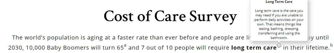 3-Show/Hide - Description Visible (Show)
I use dynamic panels frequently for more complex interactions. A core function of an interactive calculator is to display numerical data based on user input. Dynamic panels help simulate data changes smoothly. Dynamic panels are containers that allow you to set the look and interaction of several elements located in the same area of a page. Each version of the container is called a "state." Because only one "state" of a dynamic panel can be seen at each time, dynamic panels can be used to change the data that appears on the page. With the Cost of Care tool, I rely on dynamic panels to simulate the change in costs based on the location, time period, year, and interest rate that a user selects. In this example, the costs of Care Services in the New Orleans Area, LA are displayed using a dynamic panel (Image #4). By using a new location (Fresno, CA), time period (Monthly), year (2029), and interest rate (3%) the data and appearance of the dynamic panel changes (image #5).
 4-Dynamic Panel –Cost of Care Services (New Orleans Area, LA). Bottom data table is a dynamic panel._
_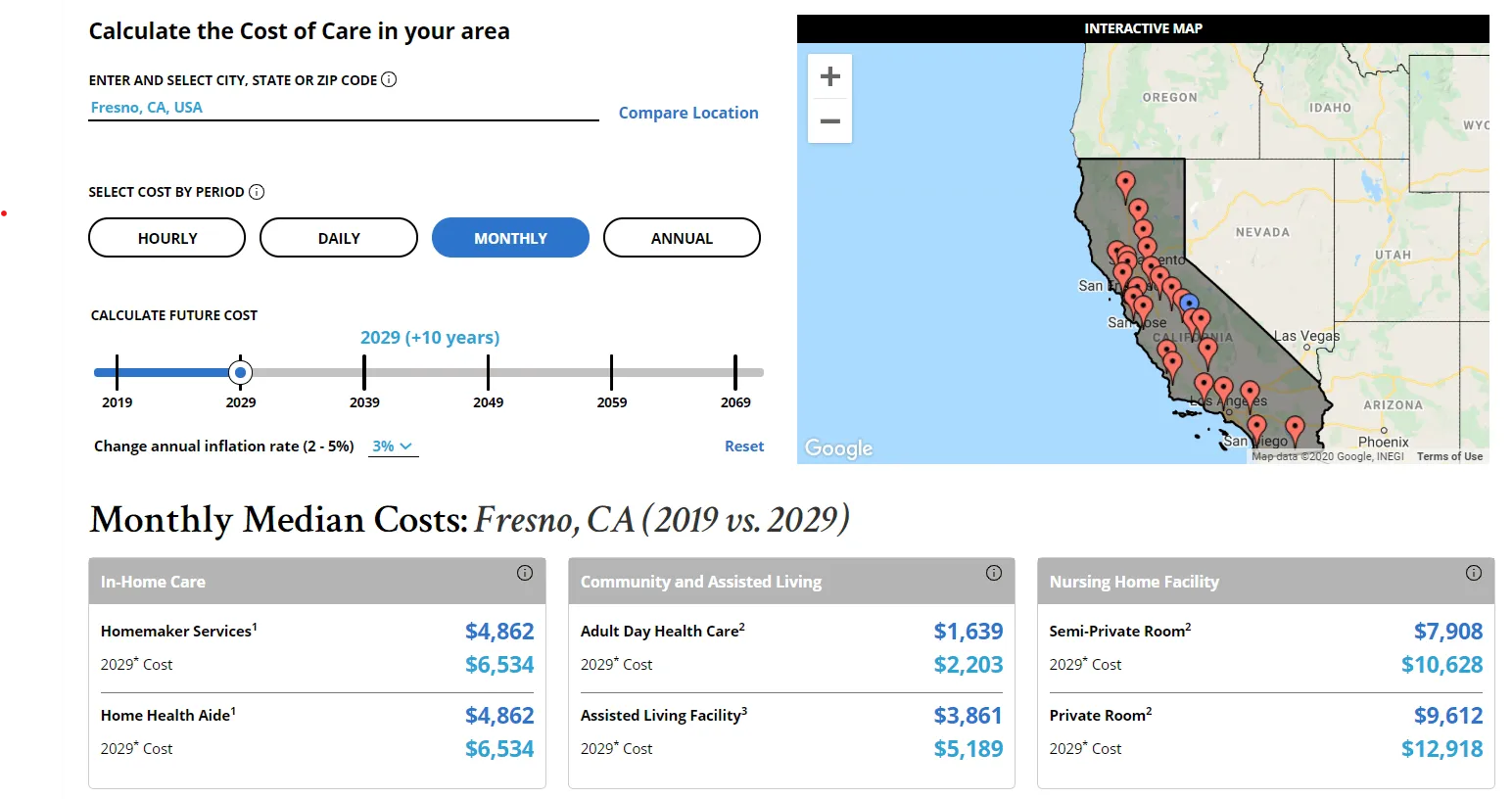 _5-Dynamic Panel–Cost of Care Services (Fresno, CA). Choosing a different location, time period, year, and interest rate changes the data and appearance of the bottom data table (dynamic panel)
3. Test with real data.
Using dummy data can work well with early iterations, but as you move to a high fidelity prototype, real data helps simulate a more realistic experience. Also, by using real data, you get an additional checkup on the visual design. You may find that you need to adjust the design to accommodate actual data output.
By using a subset of real data when prototyping the Cost of Care Calculator, we get to understand users' reactions to the data, what actions they take after seeing data, and what questions they have about the data.
Funny enough, it actually takes time to create realistic dummy data. Save yourself the time and include a subset of real data instead.
4. Test for functionality and understanding.
At a basic level, it's always important to test the functionality of a tool. Does it work the way it was designed to work? You may also need to test if users understand the data. Unlike an online version of a handheld calculator where people generally don't need an explanation of the output, with the Cost of Care Calculator, most people are not familiar with the different types of long term care services nor with the costs associated with them. Therefore, including definitions of the different types of care services as tooltips is an important part of the prototype (Image #6).
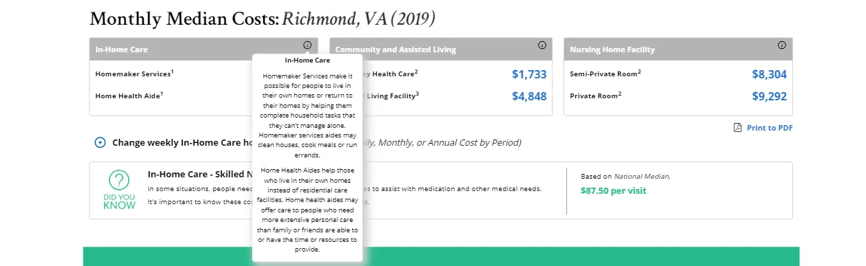 6-Tool Tip Provides Definition of Care Services
5. Find a prototyping tool with the right capabilities.
An important part of designing an interactive calculator is micro-interactions because they enhance the overall experience with a tool. Microinteractions provide the user with feedback that something on the user interface has changed based on the user's action (ex. clicked a button). The feedback can be an image, animation, sound, message, etc. With the variety of buttons, sliders, input fields, and dropdown lists, and more, available on an interactive calculator, micro-interactions help engage and reassure users that the calculator is responding to their input.
With the Cost of Care Calculator, an important micro-interaction I needed to evaluate was the feedback message from the new Autocomplete feature. As a user begins to enter a "City, State or Zip Code" into the input field, location suggestions appear as a dropdown list. When a user selects certain locations from the list, the following message appears below the input field "The closest region for Cost of Care data is: Name of a Nearby (MSA) Metropolitan Statistical Area. (Image #7) In prototyping and testing this micro-interaction, I could observe whether users saw the feedback message and did it cause any confusion or questions. While there is definitely a learning curve to create complex interactions, a high fidelity prototyping tool that can create realistic micro-interactions will help you gain a level of insight on how users engage with your data-intensive tool.

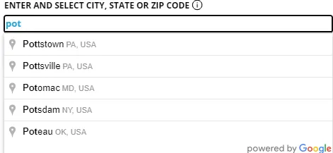
 7- Autocomplete Feature & Feedback Message
6. Name All Interactions
With an online calculator, data changes based on users entering information or interacting with page elements like buttons, text links, sliders, carousels, input fields, dropdown lists, etc. When building these interactions, it is important to name the interaction itself as well as every element that either moves or triggers a movement. As you can see from this example below, it's time-consuming and frustrating to look for a specific page element when it doesn't have its own unique name. (Image #8)
 8- Unlabeled Page Elements_
7. Avoid prototype overload.
Just because you can include a page, task, or interaction in your prototype doesn't mean you should. Use your user research and metrics, if available, to identify the key tasks most users need to accomplish. This helps you focus your prototype efforts. While there are edge cases to consider, focus on prototyping the key tasks first.
Remember the purpose of rapid prototyping is to quickly simulate a realistic experience for testing and iterating. You need time to gather and incorporate feedback from users.
Prototyping data-intensive experiences can be fun as well as challenging. These tips have helped me create effective, high fidelity prototypes that provide a rich understanding of how users interact with the Cost of Care Calculator. I hope they will help you on your prototyping journey.
Disclaimer: The views and opinions expressed here are those of the author only and in no way represent the views, positions or opinions – expressed or implied – of Genworth Financial, Inc. So get prototyping! Embrace data-intensive prototyping and download your trial of Axure RP to get started!